About the Client

SmartWheels is a GPS-based vehicle tracking solution designed for both individual users and commercial fleets. Using a plug-and-play OBD device, the platform delivers real-time tracking, driver behavior insights, and safety alerts—enabling greater visibility, control, and peace of mind on the road.

Scope of Work

Brand Strategy | Visual Identity | Positioning | Messaging Framework 

THE CHALLENGE
SmartWheels required a brand identity that could perform across two distinct but equally important audiences.

The key challenges included: 

01
Creating a unified brand identity that appeals to families seeking safety and reassurance, while also meeting the operational needs of fleet managers 
Challenge Icon
02
Repositioning the brand to support increased visibility and market competitiveness in the crowded vehicle tracking market 
Challenge Icon
03
Developing a visual language that communicates safety and efficiency without favoring one audience over the other 
Challenge Icon
04
Establishing a distinctive identity in a category dominated by generic, feature-led GPS solutions 
Challenge Icon
05
Balancing approachability for everyday users with credibility and professionalism for enterprise stakeholders 
Challenge Icon
THE INSPIRATION Where Movement Meets Awareness
Beyond Technology – SmartWheels stands for awareness, clarity, and control at the heart of vehicle tracking.
Instant, Intelligent Navigation – The map pin anchors the identity in real-time visibility, tracking, and situational clarity.
Grounded Movement – The central tyre represents mobility, mechanics, grip, and real-world reliability.
Trust in Motion – Together, these elements express intelligent movement, dependable performance, and smart decision-making.
Designed for All Scales – Equally relevant for parents tracking loved ones and fleet managers optimizing fleets.
SmartWheels Brand Inspiration Visual
Karkhana Works
THE POSITIONING Drive Smarter. Live Safer.
Intelligent Safety by Design – SmartWheels merges smart mobility with enhanced safety, built on trust, usability, and clear, low-cognitive communication.
Purple with Purpose – Balancing blue's trust and red's alertness, the palette conveys authority and intelligence while reducing anxiety and visual fatigue.
Distinct, Scalable System – A differentiated yet dependable brand identity that adapts seamlessly across digital platforms and product packaging.
SmartWheels Positioning Visual
Geometric Shapes
The impact
Trust as a Competitive Advantage
Credibility Icon
Instant Credibility

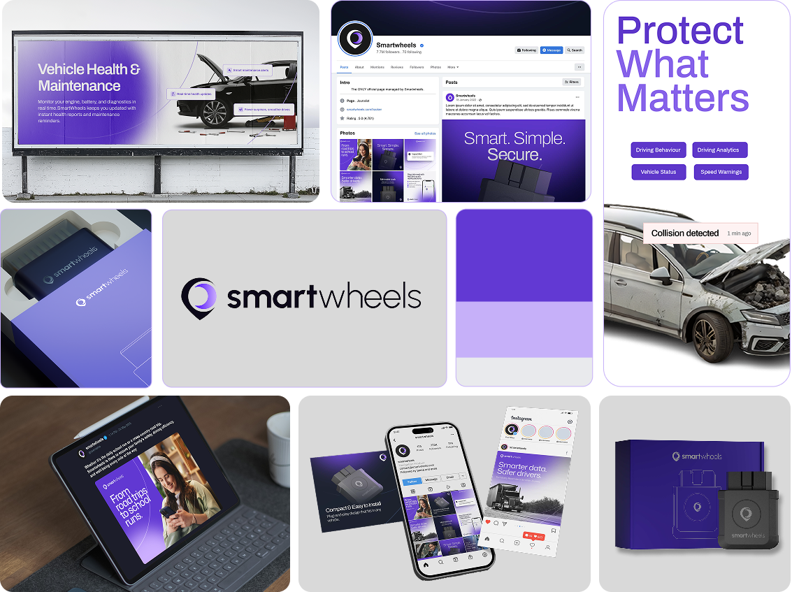
The refreshed identity delivers immediate recognizability and trust across both consumer and fleet segments.

Confidence Icon
Confidence in Use

The refined color system strengthens confidence in automation, improves brand recall, and reduces friction during onboarding and daily interactions.

Seamless Icon
Seamless at Every Touchpoint

A cohesive visual system scales effortlessly from mobile applications to physical packaging.

Growth Icon
Growth Through Trust

By reinforcing trust at every interaction, SmartWheels drives adoption, retention, and long-term customer value.

Ready to build your own digital
success story?
Let's build your next chapter
CTA Visual

Let's Start the Conversation

Tell us a bit about your branding needs and we'll get back to you.