

BShirt is a UK-based maternity and nursing wear brand founded in 2016 with a clear, focused purpose:
to empower mothers to breastfeed comfortably and confidently.
Built by mothers, for mothers,
BShirt is best known for its patented "Lift the Flap" design, an innovative nursing solution that
allows discreet, clip-free, and zip-free feeding. Since launch, the brand has supported over 50,000
mothers worldwide.
Today, BShirt stands as a B Corp–certified brand committed to ethical
production, slow fashion principles, and the use of GOTS-certified organic cotton. Its mission
extends beyond clothing. It exists to support mothers through bump, breastfeeding, and beyond.
BShirt had built something meaningful: a patented product, a loyal customer base,
and a genuine commitment to ethical and sustainable fashion. Yet its visual and verbal identity did not
fully communicate the strength of that foundation.
The opportunity was clear: build an identity
that reflects both the innovation of the product and the depth of the mission.


The brand was helping mothers feel supported, empowered, and seen during one of life's most transformative stages.
The strategic opportunity was clear: position BShirt at the intersection of comfort, empowerment, and conscious fashion.
Through collaborative workshops and category analysis, we identified a clear gap. Most maternity and nursing brands prioritized function before emotion. BShirt could lead differently.
The brand narrative was refined to reflect three lived behaviors:
The name BShirt was retained to preserve equity, while the lowercase wordmark reinforced warmth and accessibility. The brand line, "Bump, Breastfeeding, and Beyond," expanded the conversation beyond a single stage of motherhood.
This repositioned BShirt from a functional nursing label to a purpose-led maternity brand.

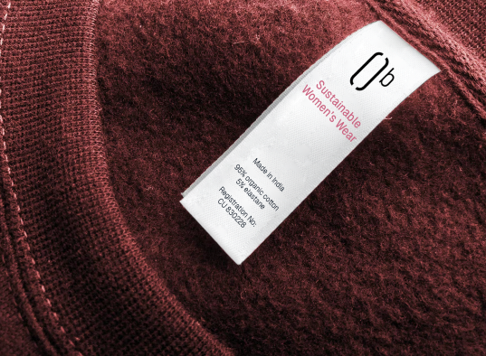
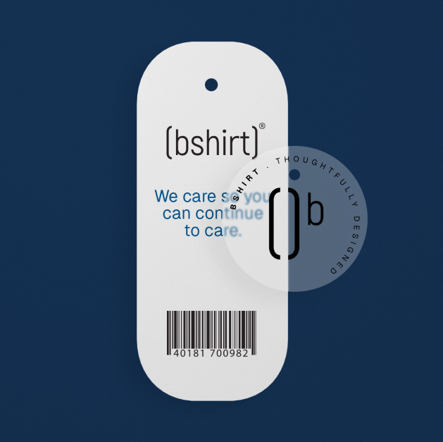
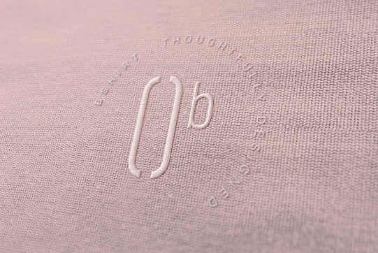
At its center is the parenthesis-inspired "B," symbolizing a held moment within the noise of early motherhood. The enclosed form creates a distinctive signature while conveying support and openness.
The curvature extends into a flexible glyph system that frames imagery, highlights details, and adapts across retail and digital environments without losing cohesion.
The color palette balances softness with modern confidence, avoiding predictable pastels while maintaining warmth. Clean, contemporary typography ensures clarity across retail, packaging, and digital communication.
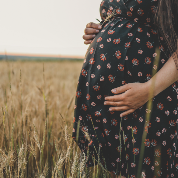
Photography prioritizes natural light and candid moments, celebrating real motherhood rather than staged perfection. A structured three-shot approach reinforces both emotion and innovation.
The result is a unified system that scales across e-commerce, social, packaging, and campaigns while remaining rooted in authenticity.
