Drawn from moonlight
Gambhir Cosmetic Medicine became Lunamé so that the trust built over two decades of physician-led aesthetic care could extend across new locations without depending on the founders' personal presence.
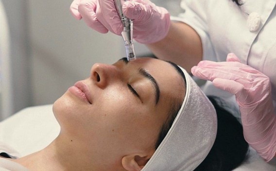
Beauty, quietly personal.
The name Lunamé draws on luna, meaning "moon," and aimé, meaning "loved" or "beloved" in French. Its final syllable also echoes "me," a quiet reminder that beauty is personal.
A founder's name places one person at the center of a brand, but the practice was preparing for a future in which its founders would not always be present. Five criteria guided the search: reduce dependence on the founders' identity, feel refined rather than clinical, be distinctive enough to support trademark protection, remain relevant to a premium audience over time, and accommodate future growth.
Bringing the Brand to Life
Watch how the Lunamé visual identity comes alive through motion, transforming the crescent moon into a distinctive brand signature that reflects growth, elegance, and individuality.
A crescent moon tucked into a letter.
We explored more than 10 directions across wordmarks, logomarks, and emblems. The client selected a clean wordmark with a distinctive detail: a crescent moon integrated into the "E." The detail remains subtle at first glance but gives the wordmark a memorable signature. Its simple construction also supports legibility across a range of sizes and applications.
The logo animation distilled the concept into motion. In the animation, the crescent moon gently transforms into the "E" in Lunamé. The transition brings the identity to life and expresses the central idea of change that preserves individuality.
The Lunamé palette combines Eggshell, Winter Hazel, Blossom, Sage Green, Brown Rust, and Charcoal to create a visual identity that feels warm, calm, and effortlessly refined. Balancing soft neutrals with grounded earthy tones, the palette reflects sophistication, softness, and understated luxury.
Used for digital platforms, body text, functional copy, and labels. Keeps clinic information contemporary, accessible, and clean.
Used for expressive and editorial moments, headers, and pull-quotes. Elevates the brand to high luxury.
Brand applications
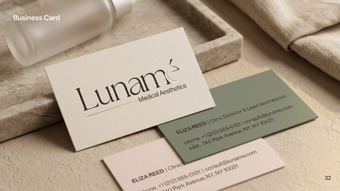
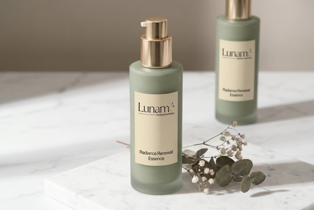
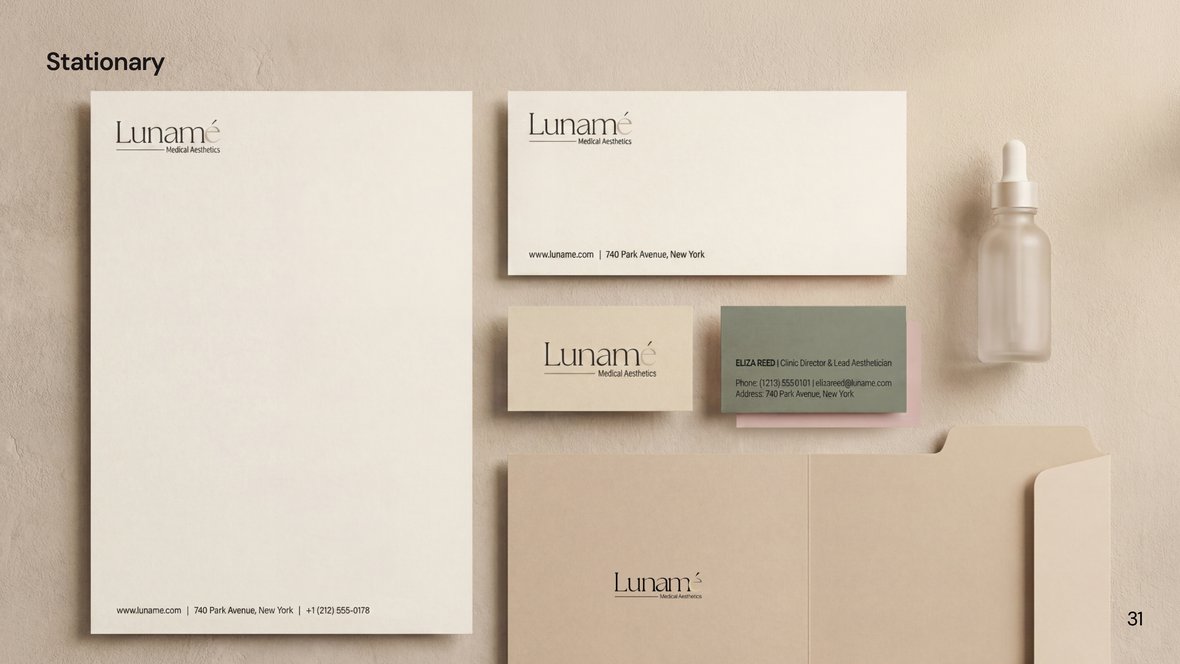
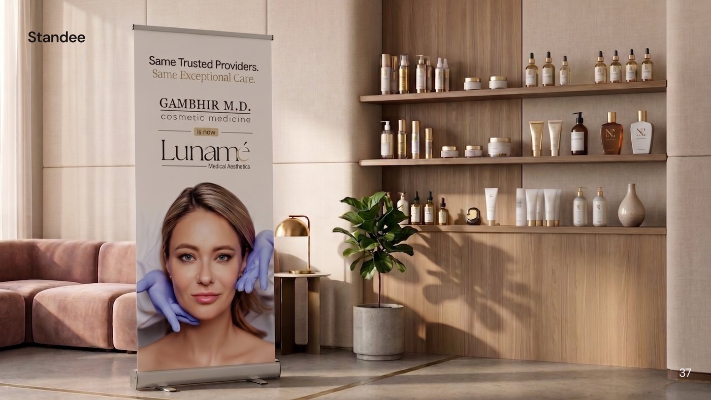
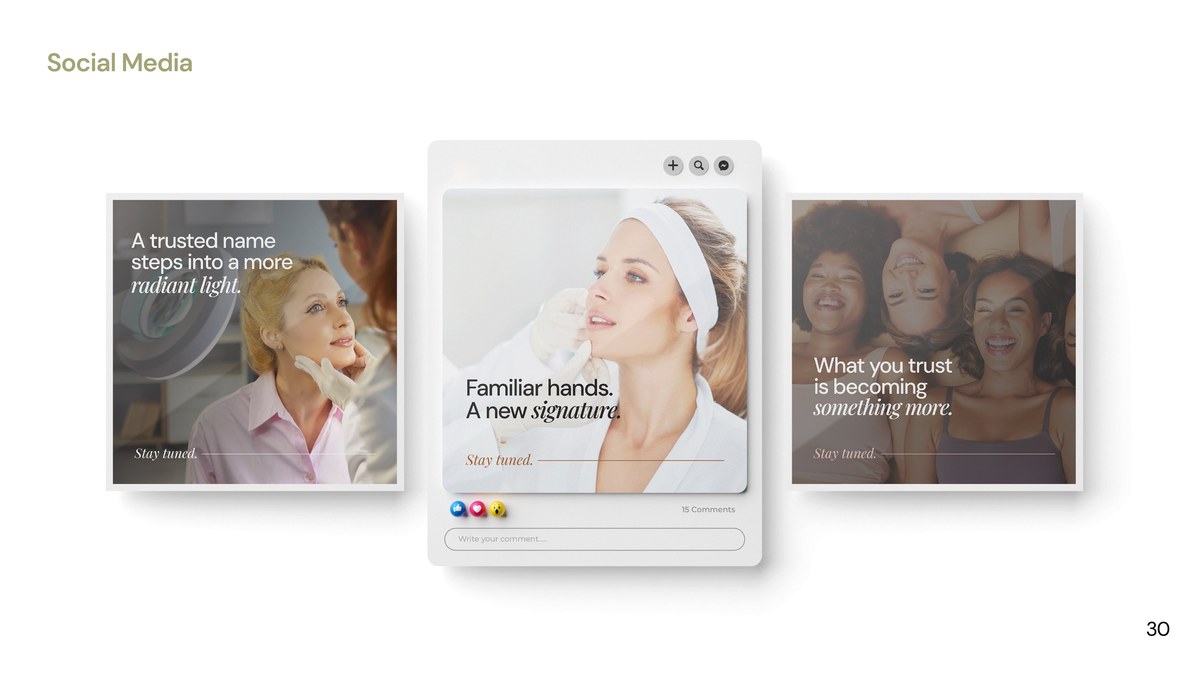
The system needed to remain consistent across every patient touchpoint. We applied the Lunamé identity across patient-facing and operational materials, including stationery, lab coats, product packaging, brochures, freestanding displays, billboards, gift cards, storefront glass, and exterior signage. The brand guidelines documented how the identity should be applied across each touchpoint, while editable Canva templates gave the internal team a consistent starting point for future marketing materials.
What the identity delivered
Lunamé now has a visual system that reflects the care and consideration behind the practice. The identity gives teams a clear visual standard, helping patients encounter a consistent brand experience across locations and touchpoints.
success story?